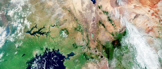
But is the cone doing its job? Studies show that people often misinterpret this popular weather graphic. They don’t understand the information it’s conveying: the likely path of a storm, and its likelihood to deviate from that path based on historical data. The graphic is cone-shaped because the farther we try to look into the future, the more uncertain the forecast. But because the cone draws a line around a specific area, many people assume that locations outside the cone will not be affected by the storm.
Researchers in Colorado State University’s Department of Psychology are working on an easily understood, science-backed way to visually represent hurricane danger to the general public. They contend that the cone of uncertainty creates a false sense of security for people who live outside the boundary of the cone and that there are better ways to signal likely impacts.
The research team includes psychology professors Jessica Witt, who studies the human visual system, and Benjamin Clegg, who studies human factors in the design of new technologies. Together, they created experiments to test whether hurricane projections could be better understood by average viewers through dynamic graphics the researchers have christened “zoomies.” Their results are detailed in Journal of Experimental Psychology: Applied.